
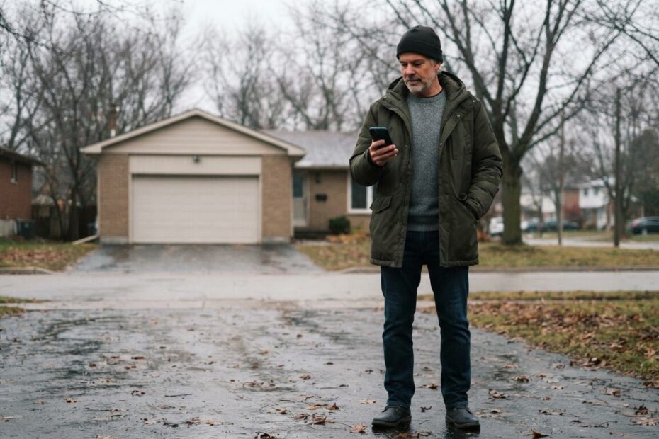
It is a cold, wet Tuesday in November. Someone is standing in their driveway in Innisfil with a dead furnace, thumbing through search results on their phone, one glove off. They find your business, tap the link, and then spend the next ten seconds pinching, zooming and scrolling. Then they go back and tap the next result.
If that sounds familiar, you may have a website not working on phones, even if it looks fine on your office computer. Most people search on their phone first, and many of them are in a hurry: in a parking lot in Barrie, in a waiting room in Newmarket, or on the side of the road. They are not browsing. They want an answer, a phone number or a way to book.
Here are seven common reasons local business sites frustrate those visitors, and a plain fix for each one.
1. Fix Tap Targets That Are Too Small and Too Close Together
On a computer, a mouse pointer is precise. On a phone, a thumb is not. When menu links, buttons and phone numbers are tiny or squeezed together, people tap the wrong thing, land on the wrong page and give up.
The fix: make every button and link big enough to hit comfortably with one thumb, with space around it. Keep the main menu short, and give your most important actions, such as Call, Book and Get Directions, their own large buttons. Test it yourself with one hand while walking, because that is how many customers will use it.
2. Make Your Phone Number Easy to Find and Tap
A surprising number of business sites hide the phone number in the footer, or show it as plain text that cannot be tapped. Someone in a hurry should never have to memorize seven digits, switch apps and type them in.
The fix: put a tap-to-call button at the top of every page, and keep it visible as people scroll. Make sure the number itself is a real link that starts a call. If calls are what turn visitors into customers, our post on why your website isn’t turning phone calls into booked jobs goes deeper on what happens after the tap.
3. Remove Pop-Ups That Cover the Whole Screen
A pop-up that fills a laptop screen is annoying. On a phone it can be impossible to close, because the little X is tiny and sits in a corner under a thumb that keeps hitting the wrong spot. Cookie banners, newsletter offers and chat boxes can pile up until the page is hidden.
The fix: cut the pop-ups that are not essential. If you must keep one, make it small, delay it, and give it a large, obvious close button. Never show a pop-up the moment someone arrives, since that is exactly when they are looking for your hours or number.
4. Speed Up Menus, Price Lists and Pages That Load Slowly
Phone signals are not always strong. In a parking lot in Cookstown or on a rural road in Simcoe County, a heavy page can take forever. Restaurant menus saved as huge PDFs, price lists made of giant images, and autoplay videos are common culprits.
The fix: show your menu or services as real text on the page, not a large file that has to download and then be zoomed. Compress your photos and only load video when someone asks for it. We cover this in detail in 9 reasons your website photos and videos are slowing down your site. A fast, simple page beats a fancy one that never finishes loading.
5. Build the Site for the Phone First, Not Shrink It Down
Some sites are really a desktop design squeezed onto a small screen. The text is tiny, columns get cramped, and visitors have to pinch and slide sideways to read a sentence. That is a clear sign the site was designed for a computer and only adjusted afterward.
The fix: start from the phone view. Use readable text sizes, one clear column, plenty of white space and strong contrast so it is legible in bright sun or a dim waiting room. This is a big part of why mobile-first website design is changing how local customers find you. A custom build lets the layout fit your business instead of forcing you into a generic template.
6. Put Hours, Address and Directions Where People Can See Them
The most common questions a phone visitor has are simple: Are you open right now? Where are you? Can I get there? If the answers are buried three pages deep, or only in an image, people will not dig for them.
The fix: show today’s hours, your address and a Get Directions button near the top of the home page. Make the address a tap-to-open link for the maps app. Keep the same details on your Google listing, so what people see in search matches what is on your site. If your business is not on Google and Maps yet, our Google Placement service is $99 and gets your business, contact details and website listed.

7. Shorten Forms and Make Booking Easy With Thumbs
A long contact form is hard enough on a computer. On a phone, tiny fields, a keyboard that covers half the screen and required boxes nobody understands can make someone quit. Think of a person in a waiting room in Aurora trying to request a quote between appointments.
The fix: ask only for what you truly need, usually a name, a phone number and a short message. Use the right keyboard for each field, such as a number pad for phone numbers. Add a clear Submit button and a friendly confirmation message so people know it went through. A simple form that works beats a detailed one that does not get finished.
Check Your Own Site Like a Customer in a Hurry
You do not need special tools to find most of these problems. Put your phone on mobile data, not Wi-Fi, and try to do what a customer would do. Find your number and call it. Find your hours. Open your menu or price list. Fill in the form. Notice every time you pinch, squint, wait or tap the wrong thing.
Ask a friend, a neighbour or a customer from Alcona, Lefroy or Bradford West Gwillimbury to try it too. People who do not know your site will find the bumps quickly. Write down what frustrates them, because that list is your to-do list.
If you want a deeper look at what to improve beyond phones, our Services & Pricing page shows how we build custom websites, and what each option costs.
Get a Second Opinion on Your Phone Experience
Fixing a website not working on phones does not have to mean starting over. Often it is a handful of changes: a bigger button, a visible phone number, a lighter menu, a shorter form. Those small changes help the person in the driveway get what they need before they tap away.
If you would like help, we serve Innisfil, Orillia, Barrie and the wider GTA, and we are happy to look at your site on a real phone with you. A team member will look at your business and make a plan with you, with no cost and no pressure.

Ready to see your site the way your customers do? Book a free consultation with ONLINEid.ca and we will walk through it together. You can also call our A.I. answering line any time at (289) 807-6364, and it will put you through to the team.